The Gmail Logo Was Designed the Night Before Gmail Launched
Ever leave an assignment until the night before it was due? You're in good company. According to a post on Quora from former Google designer Kevin Fox, Googler Dennis Hwang was up late the night before Gmail launched, working on the email service's logo.
Fox recalls:
The logo was designed literally the night before the product launched. We were up very late and Sergey and I went down to his cube to watch him make it.
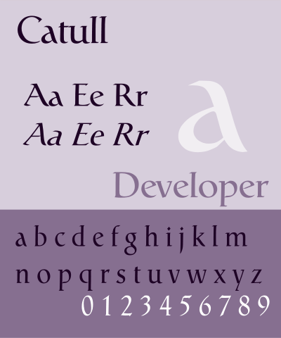 Fox says that initially they had tried to make the Gmail logo in the same font as the Google logo, a font called Catull designed in 1983. But Catull has, as Fox calls it, a "very awkward" letter 'a' (see image at right), which made it unusable for "Gmail." Hwang opted to keep the "G" in Catull but to render the "ail" in a sans serif font, which Fox believes is Myriad Pro (looks right, to my untrained eye). The "m," of course, appears as a small envelope, the ubiquitous Gmail symbol we have come to know well.
I had never noticed before how the G of Gmail was such a different style than the rest of the logo, but now that I've focused on it, that G is always going to stick out, the serif-laden man among his serif-less friends.
Rebecca J. Rosen is a senior editor at The Atlantic, where she oversees coverage of American constitutional law and government in the Battle for the Constitution series.